Saturday, June 28, 2014

Video Review

Video Review

Through the Eyes of the Sculptor:

1. For each video list/discuss the key concepts you learned.
The sculptures in the video take the forming of clay, bronze, limestone and marble. Leaving bridges in between hanging pieces of a sculpture during movement/shipment to avoid breakagae.  Being able to visualize a sculpture in your mind. Beginning with modeling clay to start the sculpting process. There is a sound that the marble makes, and that sound is what sculptors look for when trying to find the best piece of marble.

2. How do the videos relate to the readings in the text?
This video shows each method of sculpture making: modeling, casting, carving and assembling. We also see how sculptors use clay modeling to begin creating sculptures, just like how painters use a drawing to test out their ideas, which is stated in the text.

3. What is your opinion of the films? How do they add depth to understanding of the topics: Sculpture, Installation, and Craft?
I think the video about sculpting is helpful in adding depth to my understanding of the overall topic of sculpture because of the visual effect of seeing sculpting being done in video format. This video also does a very thorough job of showing the process of creating a (life-size) sculpture.

Glass and Ceramics:

1. For each video list/discuss the key concepts you learned.
The video discusses the process of glass making and how it is formed into the common objects that we are familiar with in our homes. The glass is heated to hot temperatures several times before it is a finished work. The tedious process of creating a stained glass window is also discussed, which is very interesting to see in video format, because the creation of stained glass windows is like a puzzle (modern day). 

2. How do the videos relate to the readings in the text?
Both the video and the text go into explaining how glass is made and the versatility of using clay for works of art. The creation of ceramics (clay) is also discussed as it is in the text.

3. What is your opinion of the films? How do they add depth to understanding of the topics: Sculpture, Installation, and Craft?

My opinion of the video is that it is a very helpful resource towards a further understanding of the processes that go into working with glass and ceramics. Having the information visually available in a video format makes it easier to grasp certain concepts because of the ability to see it rather than imagine how glass is made and formed, and how ceramics are fired and worked. 

Friday, June 27, 2014

Reviewing Peer Response to Artwork

1. Hyperlink the Blogs you reviewed into your Blog.
http://stocksj01.blogspot.com/

http://foundationsofartinquiry200.blogspot.com/

2. When looking at Project #1 (Elements and Principles), did you agree with the element or principle the artist listed with the images? Did you see other elements and principles in the images? 
For each person's projects of the elements and principles, I found myself agreeing with their selected images used to portray and represent the element/principle that they selected. While some images did a good job showing either an element or principle, there were some photos that included more than just one principle or element in them. In one slideshow (http://foundationsofartinquiry200.blogspot.com/) there is a photo of two dogs in the grass. One dog is bigger than the other, showing proportion in the photo. She also states that it shows balance, color and texture throughout the photo, and I agree that it does indeed show all of those elements/principles as well, rather than just proportion.

3. When looking at Project #2: Were there any images in the Peer Blogs the same as your own? If yes, what were they? Were the reasons the image was selected the same or different as your own? 
When looking at project #2, I did not see any of the same photos as my own. In fact, I found that what other people chose was very different from my own selections, which made it even more interesting to look at and read. It goes to show that as individuals, we all see things differently and like/dislike things differently as well.

4. Were there any images that your Peers selected that pique your interest now? If yes, what are they and what is your connection with them? What would you want to know about them?
In one blog (http://stocksj01.blogspot.com/), there is a picture of the mirrored room exhibit. I would like to know more about that piece, because of how interesting it looks. I am interested in this work of art, and I think it would be interesting to learn about what inspired this piece.

5. What do you think about the process of reading your peers reflection? Do you find this to be valuable in your learning?
I like being able to see the work of my peers, especially in an art class where we are learning that people all see and interpret things differently. I do find that this is valuable in my learning because it helps to be able to see the thoughts of others compared to my own, as it gives me new ideas to consider that I may not have otherwise thought about.

6. Check your Blog and read comments posted by your Peers. Do you find their comments helpful? 
I do not currently have any comments on my Blog.

Sunday, June 22, 2014

Creating a Logo

1. Discuss what you thought about creating your logo.
Throughout my process of creating my logo, many ideas came and went. I kept in mind the video we watched that showed the process of creating a logo for a company. Of course I wanted to come up with a design that would limit the interpretation and represent me. I will admit, I found it to be difficult to find an idea for a logo that I wanted to use. 

First sketches for my logo
Idea sketches for the Building Blocks Logo

2. Describe the process: creative thinking skills and ideas you used in the logo creation. 
The process in creating my logo went through several ideas before I finally decided on creating one with building blocks. I wanted to create a logo which represented the biggest part of me - a future teacher, and an individual who works with children. I wanted something to convey that idea without becoming too complicated, because I have learned that a logo should be simple but effective. In the end, after all my idea sketches I chose to go with the building blocks aspect of my logo. I also wanted it to appear somewhat cartoon-like due to the fact that many other logos I looked up on the internet went along with the cartoon-like theme. I work with and teach children everyday, so the building blocks represent the building of knowledge each and everyday. Young children use building blocks, so this logo also simply represents the children that I choose to work with. The blocks also spell out my first name, which to me was an important part of the logo. 

Building Blocks (FINAL LOGO)
3. What was the most important discovery you made in the creation of your logo?
For me, the most important discovery was figuring out what was important enough about myself that I should represent in a logo. I wanted to draw an image that could describe me just by looking at it. I discovered that it is no easy task to come up with an image that holds that much information to it, also. I also enjoyed creating my logo, because it really challenged my creative side. 

4. What is the most important information you learned from watching the videos, powerpoint, and reading material for this project? What is your opinion of the videos?
The most important information I learned was how challenging it can be to create a design that is simple yet conveys the intended message. Throughout my thinking process for my own logo, I had to remind myself that it should be simple rather than detailed. I have learned that the idea of creating a logo is easier said than done, yet there are so many professionals who are able to do it everyday. The videos were very helpful while I was creating my logo, because I kept thinking back to what I watched while I was working on my own. 


Art Gallery Visit (Albright Knox)

For my first art gallery visit I went to the Albright Knox Art Gallery and explored the artwork. Here are my findings.
A. Which artworks make an impact or impression on me? Why?

"Danseuse au Cafe" by Jean Metzinger (1912)


  •  “Danseuse au Café” (Dancer in a Café) by Jean Metzinger (1912)
    • Oil on canvas; 63 x 50 5/8 x 3½ inches 

      • This work makes an impact on me because of the geometric shapes that go in to the painting to make up the focal point of the work – the dancer and the patron. I like that the majority of the painting includes a color palette that is on the dull side, but yet there are areas throughout the painting with pops of bright colors making it more visually interesting to look at. The green of the cloak on the dancer, and the black and white diamond pattern brings the eye to the dancer, making the dancer the focal point of the painting. I felt so interested in this painting. 
"Study for Le Chahut" by Georges Seurat (1889)
  • “Study for Le Chahut” by Georges Seurat (1889)
    • Oil on canvas; 33¾ x 30 3/8 x 4½ inches 
      • The approach that Seurat has taken with this painting made it so interesting to look at for me. With the stippling throughout the entire work, yet a very clear painting of dancers and a musician, I was amazed at the detail in this work. The musician on the bottom of the painting, in the middle is darker than the rest of the painting, which leads my eyes there, yet also to the dancers with the skirts being much lighter. The contrast of colors used throughout this painting takes the eyes on a journey throughout. 

 B. Which artworks do I feel a connection with? Why? 

"Tempest in Red" by Sandra Cinto (2009)
  • “Tempest in Red” by Sandra Cinto (2009) 
    • Acrylic and permanent pen on canvas; 63 x 98 x 2 inches 
      • I felt a connection with this work of art because of the mixed media used. The use of the permanent pen is what made me feel a connection with this work of art because I have found that I enjoy creating art with permanent pen as well. The lines throughout the work of art created the feel of waves and rain in an ocean and unpredictable weather, which is very much like life at times. 
"Wall Drawing #1268: Scribbles: Staircase" by Sol Lewitt (2006)
  • “Wall Drawing #1268: Scribbles: Staircase (AKAG) (2006) 
    • Graphite on three walls; no scale given 
      • This work is very unique, which was one reason I felt a connection to it. On three walls leading up to the second floor of the art gallery, there is a graphite drawing done strictly with scribbles. The scribbles that create the work are so consistent that it looks like it could not have been possibly done by a person, which amazed me. The use of graphite also made me feel connected to the work of art because graphite is so commonly used in sketching and drawing. 

 C. Which artworks would I like to know more about? Why?

"Contact" by Ali Banisadr (2013)


  • “Contact” by Ali Banisadr (2013) 
    • Oil on canvas 
      • I would like to know more about this work of art because of everything that is going on throughout the work. There is so much to the painting that makes it very interesting to look at. Unlike other paintings I found interesting, this does not have a focal point, leading the eyes to look at the whole painting. What I would like to know is where the inspiration for this painting came from. I found the bright colors and motion conveyed throughout the work making me think that I was looking at a fight between animals almost. Because it is so abstract, I realize that there are countless ways to interpret it, which makes it all the more interesting. 
"der Morgenthau Plan" by Anselm Kiefer (1987)
  • “Der Morgenthau Plan” by Anselm Kiefer (1987) 
    • Acrylic on canvas 
      • I would like to know more about this work of art because of the unique style that Anselm Kiefer brings to the work. In comparison with the other Kiefer works that I saw at the gallery, this painting seemed to take on a brighter tone/mood to it. Other works seemed to have a darkness to them, which makes me curious to know more about the inspiration behind this painting as opposed to the others that I saw. The heavy painting creates a strong texture, making it so visually interesting to look at.

Saturday, June 14, 2014

Exploring Value and The Subtractive Color Theory

 photo 2014-06-14 18.00.15_zpskbi2urrf.jpg
   photo 20140614_175550_zpsmsuwzn3q.jpg

My Answers to the Assignment Questions: 
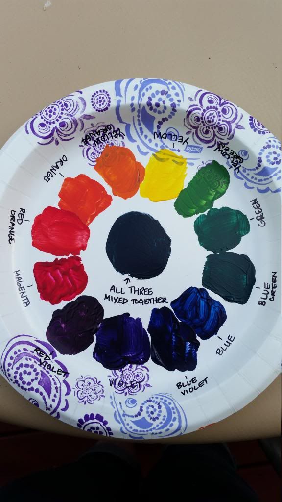
1.) Being an individual who has some artistic talent, I actually enjoyed creating the Value Scale and Color Wheel. I found some challenge with creating the value scale, because I wanted it flow through the value of black to white. While I had some challenge with it, it was not too difficult once I got the value scale where I wanted it to be.
2.) I enjoy working with the acrylic paint the best. I have always had an interest in painting with this media because of its rich colors and the ability to layer the colors as well as cover up what you don’t want in the painting. I do also enjoy using pencil because of the fact that I love creating sketches as well.
3.) The most important discovery in the creation of these studies was learning more about the creation of the value scale.
4.) The most important information I learned from watching the videos is the fact that what we have been taught about primary colors is false. Red, yellow and blue are not in fact the correct primary colors. The correct primary colors are magenta, yellow and cyan. In actuality, this makes more sense when mixing the primary colors together to create the secondary colors.

Sunday, June 8, 2014

Visual Elements and Principles of Design


This slideshow has various images of artwork that shows examples of the visual elements of art as well as the principles of design.
Visual Elements: 
Line - The photo of a drawing of a ribbon is an example of line.
Shape - The painting of a bird shows an example of shape, as it is a two dimensional shape drawn to look like a bird.
Mass - A photo of a flower shows mass because of the three dimensions to the flower seen here.
Light - This is a photograph of a wall on a building where the sun is hitting it. The light is shown with the silhouettes of people that are not otherwise seen in the photo.
Value - A drawing of several shapes including cones and spheres shows value because of the light and dark areas shown to bring dimension to the work.
Color - The abstract looking portrait is an example of the use of color because of the variety of colors used throughout.
Texture - Texture is exemplified in the picture of an ear of corn. The way light hits the kernels brings texture to the drawing.
Space - The still life of vases shows the element of space because of the space seen between some of the lines, and also in the background.
Principles of Design: 
Unity & Variety - An abstract painting shows unity and variety with the unified way in which each shape brings the painting together. There is variety here as well because of the various shapes, and no one is the same.
 Balance - The painting of the fish shows and example of balance because although it is asymmetrical balance, the fish are evenly placed on the painting so as to not have an unbalanced work of art.
Emphasis & Subordination - The photo of a beach shows emphasis and subordination because of the dark trees and foreground contrasting with the sunset and reflection on the water. The sunset and reflection are emphasized because of the contrasting darkness of everything else.
Proportion & Scale - The drawing of a vase with fruit shows proportion and scale because the sizes of each object in the still life are close to being true to their actual size and scale.
 Rhythm - Rhythm is shown in the photo of a waterfall. The water is moving down the rocks in a rhythmic motion that can be seen in this photograph.

Color Theory and Emotional Effect

Color and it's effects on emotions:

1. Each individual perceives color different from the next person. Although we all perceive colors in our own way, what does not change is the effect that color has on our emotions. Certain colors and hues are often associated with a specific symbol such as a red stop sign. If it were all of a sudden to turn yellow or green, we would only see a yellow or green sign and not be likely to stop. That is a bit exaggerated, but the point is that the human eye processes color quicker. Each color has become a symbol for at least one emotion that we feel as humans. Red for example is often shown for love. Red is also a color that symbolizes anger, and many other emotions. Yellow is a bright color that is associated with sunshine and warmth. It is been studied that red also stimulates an appetite in us, which is typically why it is often seen in restaurants. Blue tends to be a symbolic color for sadness, but also the color of the sky and water at the beach. Each color can also vary in intensity, which can have a different effect on how we feel as well. Changing the value of a color can completely change the way it is seen. For example if too much black is added to the color yellow, it becomes green. Intensity, value, and hue are all factors in how a color is reflected or refracted for the human eye to see.

2. A theoretical aspect of color that fascinates me is the idea of the additive and subtractive color systems. The two color systems are two different ways of creating and mixing colors together. Subtractive is the mixing of dyes and pigments, while additive uses light, such as the mixing of two different light colors to create the right mood on stage for a play. These two ideas put together are newer to me than the other aspects of color.

3. In watching the color video, the segment showing Titan's Assumption of the Virgin and how it was painted using the various colors, specifically the variations of red had the biggest impact on me. The idea of having to layer each color in order to achieve the correct pigment for the shading and value is amazingly done in the painting. Painting on such a grand scale is so amazing to me as an individual who is interested in the composition of works of art.

4. While watching the feelings video, what made the biggest impact on me was with the Mona Lisa and the discussion of its importance. Being that the painting was done of a human being and not of a higher divine figure makes it important because of the time period it was painted. The smile also suggests happiness, as well as individuality in the painting. The fact that the Mona Lisa is the most famous painting in the world is also impacting.